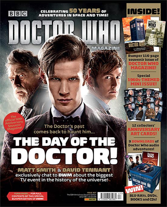
Title of Publication
The title of the magazine has been placed in the top third of the cover so that it is easily visible to the reader and catches the eye from distance. The typography and font of the title is a very bold, immediately allowing the viewer to read it from distance and catch the viewers eye. The silver colour of the masthead also connotes a futuristic, Sci/Fi feel which links to the plot in the Dr.Who series.
Slogan
The slogan of the cover is placed above the masthead in the top third. The slogan effectively accentuates Dr Who's long lasting success as the gold typography used in the text "50 years" connotes an award winning series which will attract the reader. The placement of the slogan also allows the reader to immediately read about the franchise's success immediately after they look at the title which therefore purposely drawing attention to it.
Central Image
The central image of the cover is an image of Dr Who. This use of celebrity endorsement alone is a way of attracting readers as the readers of the magazine are largely going to be fans of the Dr Who franchise, and therefore the main protagonist of the franchise on the cover will immediately attract Dr Who fans. The use of direct address not only from the main protagonist but the former Dr Who's as well engages the viewer of the cover making them feel intimate with the characters and drawing them in to read the magazine. The serious look on all three character's faces also creates an enigma code as to why they are so serious, which makes us want to read the magazine to find out why they all look so tense. As well as this the viewer will wonder why three Doctors have been used in the front cover, will we possible see former Doctor's return in the latest series? The image makes us curious and want to buy the magazine to find out the answers.
The way in which the main protagonist and central image overlaps and obscures a small section of the title also brings attention to the image, which is the main selling point to viewers as the main target audience is Dr Who fans, and the magazine has purposely made him overlap the title to give more attention to the image of the Doctor, the person the readers want to read about.
Flash/Cover lines
The main flash line of the cover is the text "the day of the doctor!". This has been placed on the lower section of the cover to not take any emphasis away from the title or the central image which will be the main "pull" features of the cover. However the large font gives a clear indication as to what the magazine is about. The larger font used for the word "doctor" again emphasises him as a selling point of the magazine and the cover is clearly trying to appeal to the target audience of Dr Who fans.
Free Offer
A whole column of the right side of the page is dedicated to free items within the magazine. This will attract readers and buyers as society likes to make the most of their money and take advantage of free things, therefore adding free prizes to a magazine makes it seem a more worthwhile purchase. The column is also a gold colour which accentuates the feeling that the prizes are valuable and an expensive item whereas in reality it is a small book. The Red font on the column makes it stand out on the front cover and therefore again draws attention to the free items.
Competitions
Competitions are used on the magazine cover as it offers the chance to win a selection of Blu-rays, DVD’s, and CD’s. The text ‘WIN’ is large, capital, and a bold white in a red box to emphasise the competition and draws attention to it, causing people to think that they have a chance of winning a valuable prize and causing them to want to buy the magazine. It also offers the chance to collect anniversary art cards, which could have significant value to Dr. Who fanatics and therefore publicises the magazine further.
Barcode, Date and Price
The bar code on the magazine front page is placed at the bottom right side of the page ina small font to draw as little attention to it as possible. This has been done to also hide the price in a small font as the magazine producers are aware that the price is likely to be off putting to potential buyers. Therefore by keeping the price out of the way and not drawing attention to it a viewer may chose to buy the magazine because they were attracted to it and the price only becomes an issue later when at a counter, when it is usually too late to put it back.
Target Audience
The main target audience of the magazine is Doctor Who fans that passionately follow the franchise. It is mainly aimed at people aged 12 - 25 as this is the predominant age group of Dr Who viewers. Also, males are more likely to purchase the magazine due to the more manly approach of the characters in the images and the colour scheme being dark and mysterious that won't appeal to females and Dr Who viewers are predominantly male. However there are only males in the image so it could be argued that there is a female gaze and that due to these men on the front females would be attracted to the magazine.
No comments:
Post a Comment